Misc.
A collection of smaller projects that I have made. Some personal stuff, just for fun and some school projects, not big enough for their own entries. Enjoy!
My friend told me of a tweet where someone had written about a dream they had. In the dream, they saw a McDonald's poster with the tagline “We Have It”. They were confused and wondered what “It” even means. I was inspired and figured that a company as famous as McDonald's could pull off some really bold designs like that. I wanted to see what that might look like!
We Have It.
DIY Screen 2019
My submission to the Screen Print Competition 2019. An annual design competition where design students send in their creative work. The theme of 2019 was “Do It Yourself”, a theme that I wanted to challenge. Society's obsession with doing things on your own and the myth of self realization is to some extent harmful and perpetuates this ideal of independence. This pressure to perform and be self-sustaining is the source of much anxiety and stress. This is my attempt to visualize this.
Book Covers
While applying for a job in book design, I was prompted to make two covers; one for a children's book and one for an adult audience. For the children's book I used an illustration I was working on, a character design for a story, as he was “cartoony” enough to fit in here.
In The Adult book I wanted to experiment with Nordic noir, thrillers, detective stories. I feel like I have seen so many at the bookstore. It seems important to create an aura of suspense and light dread. It's not a horror story, but a more raw and tangible spooky atmosphere seems appropriate. Hence, The ominous mist and bleak colors..
Ge Blod
This one was a group project during my time at YRGO´s design program. The group wanted to make a somewhat provocative blood donation ad campaign. We wanted to be a little annoying and eye-opening at the same time with our clear yellows and message. We also made sure to prominently feature the “Ge Blod” logo so that people may easily recognize who made the call to action!
Original Art By Isa Cervin
Talmanfred Merchandise
Me and a few friends of mine used to run a meme page on Facebook called “Talmanfred”, a page designed to prop up and promote my little brother as a top political figurehead in the upcoming election. Later on, an assignment popped up where we were supposed to design merchandise, and I jumped at the opportunity to create some official Talmanfred merch.
Most was just for fun, but I did end up finding a website that specialized in creating custom design merch. Me, my brother and my friend ended up ordering ourselves an official Talmanfred coffee cup each, from which we drink our coffee from to this day!
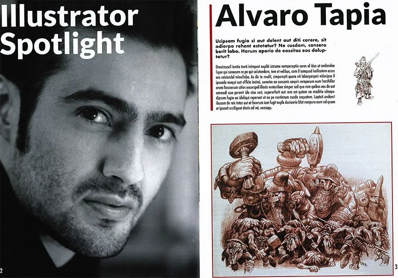
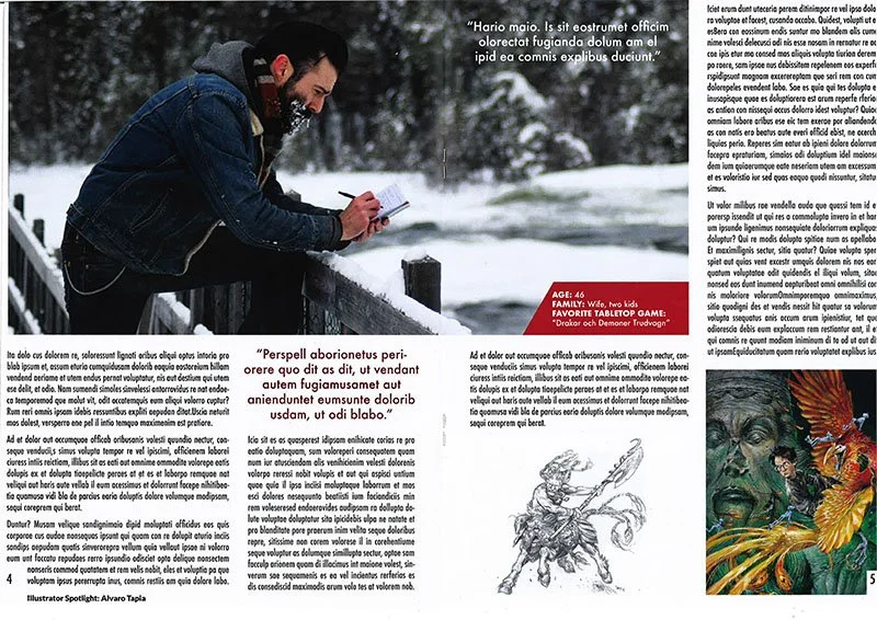
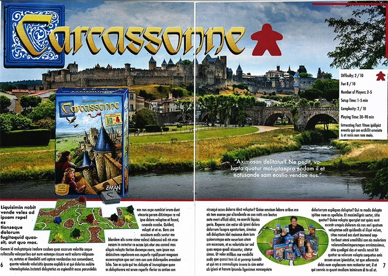
This was to be the cover page of a magazine, as part of a student project, the content of which we the students were to chose for ourselves (cover art by Paul Bonner for the Riotminds campaign book Snösaga). The assignment prompted us to create a magazine we would read and that covered a topic we would be interested in. Being a bit of a nerd myself, I set out to create "Tabletopper", a magazine in which I could read about nerdy board games and highlight an often underappreciated profession; the artists and illustrators that help bring these settings to life.
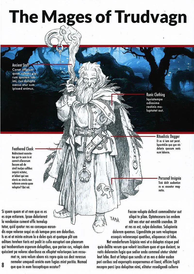
Alvaro Tapia is one of my favorite illustrators in the world. For this project, therefore, I could not resist giving him some well deserved praise. Each issue was to feature an illustrator, as many if not all board games and featured nerdy books have incredibly talented illustrators that are often underappreciated by the general masses. My magazine I imagined would change that by promoting these talented individuals.
Growing up in Sweden, many kids have seen Tapia´s work, though they may not realize it. He is the artist behind the swedish covers of the Harry Potter books. Furthermore, Tapia is also one of the artists working on the role-playing game "Drakar och Demoner" which is where most of my appreciation of the artist comes from.
Let's talk about the board game of the month. A section most people would expect in a magazine called "Tabletopper", I imagine. Although there were many candidates for this section, I had to chose one which I adore myself for this first (and only) issue. Carcassone. A beloved classic and rightfully so, in my opinion. Easy to pick up and understand yet behind this simple facade hides an incredibly in depth and intricate game which allows new players to play it and understand the rules immediately, but it keeps the interests of veterans by allowing true skill and experience to be rewarded by understanding the ins and outs of the game. For my purposes I needed to promote the historical background, emphasizing the aesthetics of the game and creating a reoccurring element which quickly would draw in the uninitiated and give them a quick overview of the featured game.
This was to be the final page. It features an illustration from Tapia and would’ve given a brief insight into how the illustration fleshes out the worldbuilding of the game and how the lore of the game complements the illustration. While the font choice is hardly a favorite of mine nowadays it is the same font used in the beloved "The Elder Scrolls V: Skyrim" as I imagine a lot of my readers would be familiar with it and perhaps subconsciously associate the magazine and game.
Unihome Special Metal Badges Design
While working as part of “Skyltmax” prepress team, we would occasionally get special design assignments. Most of the signs of the company came predesigned by the customer, but when the finish company “Unihome” needed new metallic name badges, I got to develop design suggestions for them to chose from.
I took a good look at their graphic profile and used their elements and shapes as I developed a few designs for them to ponder. The signs were then produced and shipped to the customers.


